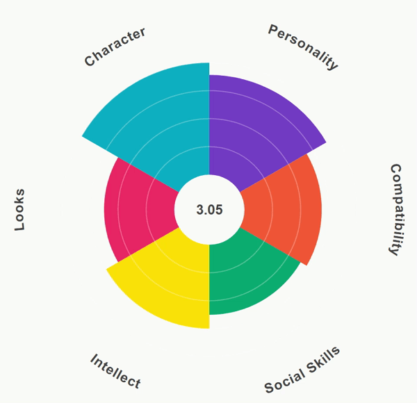
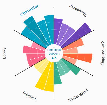
Dating Preference Aster Chart
THE STORY
A dating app introduced a feature where the users have to score from 1 to 5 - 1 being least important and 5 being most important - what traits and sub traits are important for them in their prospective partners. These ratings would be used to find suitable match suggestions for the users. The app wanted to show the user their rating scores in the form of an attractive visual.
THE VISUALIZATION
Since the visualization was showcasing human traits, we decided to go with vibrant colors to represent each trait. After trying through many different diagrams, we finalized on the aster chart since it looks beautiful with the various colors and illustrates the scoring of each trait effectively.
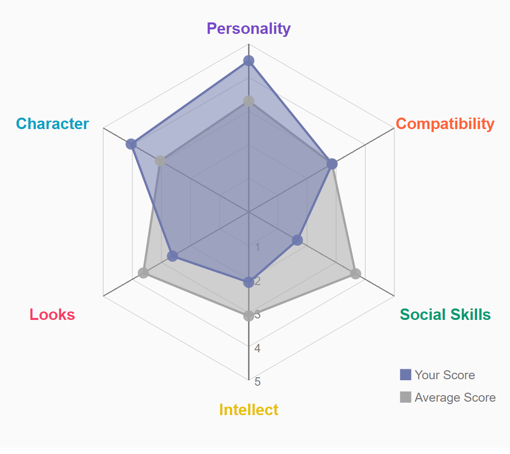
We suggested that we can show the user score as compared to the average score of all the users or a particular group of users. So a user in a specifc group (based on basic details like age, sex, preference etc.) can compare his/her score with all users across all categories or users in his/her specific category.